
9 Newsletter Signup Form Tips For More Subscribers [2024]
Published By Marilia Dimitriou
December 6, 2023

06/12/23
How can you encourage new website visitors to subscribe to your email newsletter? We present you with the ultimate solution: the newsletter signup form.
If you want to master online forms, you also need to know how to optimize them. Learn valuable tips to design eye-catching newsletter signup forms that convert, including examples from real brands and why they work.
Try Moosend Today
The easiest and most affordable email marketing and newsletter software!
Are you ready to get your signup rate to the stars? Let’s do this!
What Is A Newsletter Signup Form?
Let’s start with the basics: Email marketing is an effective marketing technique, with an ROI of $42 for every dollar spent. To reap its benefits, you first need to get the customer’s opt-in to comply with GDPR guidelines.
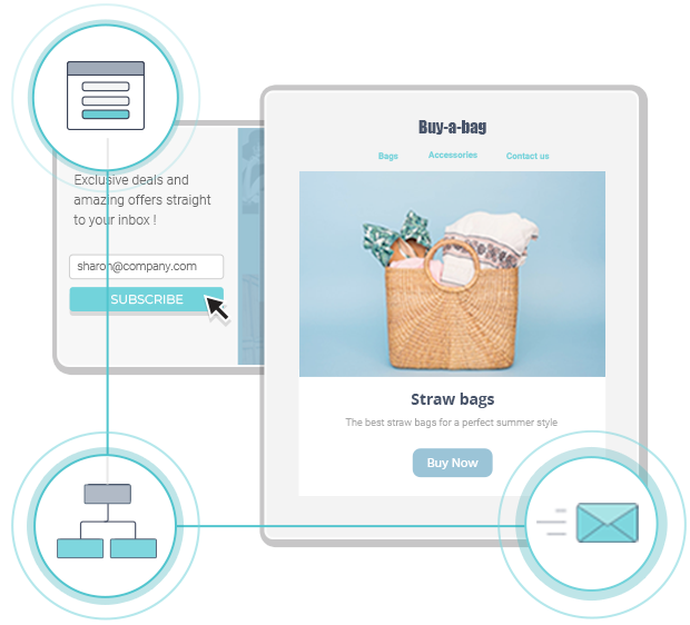
An email newsletter signup is a form used to capture a visitor’s email address. When the customer subscribes, you can add them to your email list and start sending them meaningful newsletters.
Newsletter signup forms come in different shapes and sizes. Whether they are a sticky, a popup, or a full-page form, their end goal is always the same: to capture potential subscribers.
Thankfully, many marketing platforms like Moosend or Mailchimp allow you to create those assets in a flash. For example, with Moosend, you can access premade email, landing page, and online form templates – all-in-one. Sign up today and try them out!
How To Design The Perfect Newsletter Signup Form
What exactly do you need to boost your newsletter signup rate? Get ready to dive into the best newsletter signup tricks that every successful marketer should know.
1. Choose The Right Placement
To ace your form page placement, you first need to know the most common types that most form builders offer:
- The classic popup form we all know and adore
- The inline subscription form appearing within a page’s content
- The floating bar form located at the top or bottom of your page
- The sticky form that sticks with the visitor no matter how far down they scroll
- The full-page form covering a visitor’s entire page
Later on, we’ll discuss how to find the best placement for your own website, so fasten your seatbelts!
2. Make Your Forms Simple
Simplicity is the ultimate weapon to nail your forms and get your visitors to sign up. Create a branded form with a simple outline to draw the readers’ attention on what really matters.
Don’t hesitate to add a splash of color, especially when it helps to make your CTAs more distinct.
Here’s a fantastic example by MVMT. They’ve added a simple photo demonstrating one of their stylish products and picked light blue to emphasize the discount and the CTA button.

3. Add A Clever CTA
Calls-to-action (CTAs) are the most critical elements to convert your visitors into newsletter subscribers.
A well-crafted call-to-action button doesn’t always have to be full of visuals and colors to work. Choosing the right copy is key to acing your CTA buttons but can be a little tricky. For instance, if you make it too long, you might get your visitor bored. Similarly, if you make it too short, they might not even notice it.
So, what’s the secret to acing your CTA copy? Highlighting the value of joining your mailing list is of paramount importance. To give you a clue, here’s an example from Spoon Graphics that speaks for itself:

However, your CTAs need to stand out to be effective. While Spoon Graphics has amazing copy, it completely overlooks the fact that the background color and CTA box are the same.
“Hiding” your CTA will reduce the efficiency of your form and even annoy the visitor, who won’t even search for it. To avoid that, try to make your CTAs more visible, like this one from the Morning Brew, found at the top of the website:

4. Choose The Right Timing
While you might think that your popup display time is trivial, timing is one of the most crucial elements you need to optimize before publishing your forms. For example, if you display a popup the moment a visitor enters your website, it is going to annoy them. Instead, displaying them when visitors show exit-intent can work miracles.
Delivering a great user experience with timed popups will increase your visitors’ likeability of clicking on your CTAs. So, if you want to skyrocket your newsletter subscription rate, you have to wait for these crucial seconds to pass and then schedule an irresistible popup to capture their email addresses.
That’s why Swarowksi made sure to wait for a few seconds while browsing their homepage before showing off the pop-up form, which is stunning by the way:

The first thing you need to master in your popup display is to search for your visitor’s average time spent on your page. Then, based on your products or services, you can determine how much time your visitor needs to digest your content.
You can use a tool like Google Analytics to track everything down. And remember, the right popup display time can be a process of trial and error, so don’t be afraid to test things until you get the best results.
5. Offer An Incentive
We all know that modern consumers won’t give you their email address unless you provide them with something amazing in return. Capturing their attention with a well-crafted form is the first step to getting them aboard. But do you know what will ultimately get your visitors to subscribe?
Rewarding them is the ultimate tactic to help them make up their minds and realize the value of joining the tribe. Be it a coupon or a free ebook, visitors always love getting something back after completing your email newsletter signup process. So, to maximize your signups, try to find out what your audience wants to receive in exchange for their email, and voila!
Here’s how Pipcorn approached that:

6. Conduct A/B Testing
Do you think that you’ve found the perfect newsletter signup formula to boost your conversion rates? Here’s where A/B Testing comes in to help you supercharge the effectiveness of your newsletter sign-up. A/B Testing is a method that lets you compare two versions of the same variable.
For example, you can test different versions of your copy to see what works best. Most importantly, you can test the newsletter signup placement on your website. While the classic popup can do the trick, sticking to only one type won’t help you find the perfect page placement for your form.
Finally, your headlines are your most significant impression triggers, influencing the performance of your newsletter signup. Instead of using boring headlines, try coming up with exciting captions that will get your visitors to click on your CTA, and run an A/B test to find your winner.
7. Use Social Proof
According to the definition, social proof is a psychological and social phenomenon wherein people imitate the actions of others to determine what is the right way to act in a given situation.
Here are some social proof types to choose from:
- Number of satisfied customers/subscribers
- Expert endorsements
- Testimonials
- Visual social proof
Social proof is a tool that holds tremendous power when you leverage it the right way. Whether it is a testimonial or your subscriber count, social proof can reduce uncertainty and increase your form’s efficiency.
Does it sound too good to be true? Here’s how Baremetrics does it:

8. Understand Visitor Intent
Depending on your industry, there are different newsletter signup templates to meet your goals. For instance, SaaS forms usually give visitors extra material, while eCommerce forms offer discounts.
SaaS newsletter signup forms usually have various lead magnets like e-books, whitepapers, reports, or presentations. Nevertheless, wouldn’t a nice discount be more appealing than a simple e-book?
Well, it depends on your audience. When it comes to SaaS buyer personas, free educational content is far more valuable than a simple offer. Giving your audience the knowledge to use your product/service is a common practice to capture and nurture your email subscribers.
9. Send A Welcome Email
Once your audience signs up for your mailing list, it’s essential to send them a welcome email campaign to start communication via this channel smoothly. Moreover, welcome emails have the highest open rates, reaching 91.43%.
If you offer an incentive for new subscribers, add information about how they can claim their reward. You can also share with them what they can expect from you going forward to bring more suspense. And if you want to get their double opt-in, you can ask them to confirm their subscription.
Looking for a successful welcome email example? Look at his amazing campaign from Bezar, with smart calls-to-action, including a referral option and social media links.
Subject Line: You’re In! Sweet. Welcome To Bezar, The Marketplace For Design

Pro tip: Always remember to add an unsubscribe button and give your customers the option to say bye if they wish. If not, spam complaints will start rising and email deliverability will decline over time.
4 Newsletter Signup Form Examples That Steal The Show
It’s time to dissect some of the best newsletter signup examples to see what makes them tick. Let’s do this:
1. AriZona
The Beverage Company AriZona chose a pop-up form to increase lead generation. Let’s see how they did!

Why It Works:
This newsletter signup form follows the brand’s overall style, with funky colors and elements. Their copywriting is straightforward and gets their messages across with clarity.
The CTA is attractive enough to motivate visitors to claim a generous 10% discount of their first order. The CTA button pops out with great color, and the visitors can quickly tell what they must do to get their prize.
Finally, the form’s design is enhanced by cute visuals in the form of stickers that complete the design!
2. General Assembly
General Assembly has a form that gives its visitors all the right reasons to subscribe to their mailing list.

Why It Works:
The company manages to personalize its user’s experience by asking them what they’d like to learn. Collecting customer details will also allow you to get started with list segmentation and deliver targeted content to nurture your subscribers by means of automation.
This signup form starts with a powerful headline attracting customers with free services. The copy presents the irresistible value proposition of the form, making the customer one of the first to learn.
To boost the success of the form, General Assembly uses the image of a young man taking notes. Plus, according to color psychology, red is one of the best choices to capture your visitor’s attention. The minimalistic design also benefits the CTA, turning it into the first thing the visitor will notice.
3. Rogue + Wolf
Rogue + Wolf is a brand with a unique brand image reflected on its website and various marketing campaigns. So how do they treat their newsletter signup forms?

Why It Works:
Its simplicity and the way the headline conveys the brands’ character in a single line is phenomenal.
The use of specific language that reflects the brand’s culture also captures the visitor and gives them more reasons to subscribe. Overall, this popup is a prime example of matching your forms with your website design. Rogue+Wolf uses its amazing visuals to attract attention and get its visitors to act.
While the CTA could have been a different color, the white font and exceptional copy make up for it.
4. Copyhackers
Copyhackers chose to embed their email newsletter signup form in a simple way on their website. Let’s see the result!

Why It Works:
From the headline, the reader can quickly understand what this form is all about. The information coming up uses the power of social proof to convince visitors to sign up, reassuring them that they can unsubscribe anytime they want.
Even though this newsletter signup flows organically with the rest of the website content, it’s hard to miss based on the placement.
The Takeaways
As your newsletter signup training is now complete, it’s time to give you the title of the new newsletter sign-up master! After reading this, you will be ready to optimize your email newsletter signup and ace your list-building endeavors.
So, what are you waiting for? Optimize your forms now, and in no time, you’ll see your signup rate fly to the moon. And don’t forget to sign up for a Moosend account to help you reach there faster!
Similar Posts


Create, send and optimize your email marketing campaigns!