
Landing Page Optimization: From Lead Generation To World Domination For 2024
Published By Tea Liarokapi
December 6, 2023

06/12/23
I know, you’re here because there’s something stressing you out. And this something is called “landing page bounce rate”. You’re looking for a solution, for the best practices, for landing page optimization! It’s only logical…
Well, my friends, you’ve come to the right place. Get ready for yet another one of my Ted Talks!
So, if you want to go from optimization, to lead generation, to world domination in just a click or two, keep reading!
Just need some examples and you think you’re all set? Get ’em!
Intro, Y’ All!
We can’t go about discussing anything landing page optimization without defining what a landing page is, first.
The reason behind that is the fact that some-many-get all mixed up between a landing page and a homepage and frankly, we need to end that debate before continuing.
Now, say it with me people, loudly for those at the back, please:
A LANDING PAGE IS NOT A HOME PAGE!
And for those of you that are still confused, let me clear the air once and for all.
What Is A Homepage?
A homepage is the starting point, the “front door” of a website. It’s the page that loads when you visit a website by clicking on the domain name.
For example, if you want to visit Moosend’s website, you’ll click on https://moosend.com.
Then you’ll find yourself here:

You can see that there is a navigation bar at the top, which gives you links that will take you here and there and help you navigate across the website.
Some homepages have a search bar, others don’t, and there’s always some information here and there.
What Is A Landing Page?
A landing page, on the other hand, is more like the welcome mat at the front of your door: You bought it because you loved it and then you got bored of it and changed it.
But in marketing terms, it’s a page that has been created for one very specific purpose: to aid a campaign’s conversion.
What does that tell us?
That a landing page is the page where the prospect lands after clicking on an ad somewhere across the web.
(Source)
A landing page carries no links to other parts of the website and is centered around one very specific thing: the call to action, or CTA, for short.
The design is simple, no-nonsense and the reason it’s there is pretty clear: there is some conversion to be made. Hence the need for landing page optimization.
But what kind of conversion is there to be made? Is a landing page the same as another landing page? Are there different types of landing pages? What is landing page optimization for lead generation?
Let’s get specific…
Landing Pages: The Categories
There are two main categories of landing pages, each one designed to serve a different purpose.
So, you’ve got your lead generation landing pages and you’ve got your click-through landing pages. Let’s go see what their differences are:
1. Land, Click-Through, Convert!
A click-through landing page will appear between two pages and is mainly used in eCommerce.
Its function is pretty simple: they’re there to convince people to click “next”. Ie, click through to another page, after having read all the information needed, in order to achieve conversion.
In other words… Actually no, let me give you an example: So, you’re happily scrolling Facebook and you click on an ad. And you get redirected to a click-through landing page:

(Source)
(This is one of my favorite apps of all time, by the way.)
Now, if I click on the CTA, I’ll go here:
I saw the ad, I clicked on it, I landed on the landing page that had all the information I need about the product and by clicking the CTA… Voila! I’m on their log-in page and ready to get started.
The main point here was not for someone to capture my information (ie, a lead), but to make me convert quickly and without breaking a sweat.
So, if you want viewers to make a purchase, register for a free trial or if you need to showcase your product through a demo, this is the landing page to use.
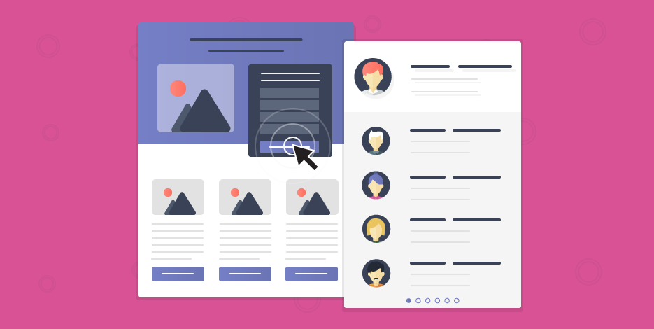
2. Land, Check, Generate!
And now we’ve got our lead generation landing page. The reason why we’re here. The answer to all of our prayers. Okay, I’m stopping now!
A lead generation landing page is there to generate leads.
Basically, lead-gen landing pages are used to collect the users’ data you’ll need further down the line, in order to communicate with them.
So, we’re talking about names and email addresses.
Let me give you a “for instance”. I clicked on this ad here:
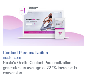
And got redirected here:
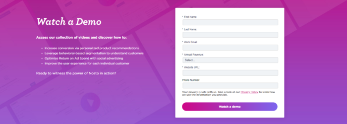
(Source)
I’ve got a form to fill out with all the information this company needs, in order to reach me further down the line, right?
What I’ve also got, is what I’m getting in exchange for these pieces of information. Which, in our case, is a demo and access to a collection of various help videos.
By filling out all the data, I give the company the opportunity to check whether I’m a proper lead or not.
Hence, generate a lead that they’ll need to nurture, down the line, and, hopefully, sell to.
But in order to do that, the landing page will need to have an adjustment or two, leading us to…
Landing Page Optimization For Lead Generation
I assume that, at this point, there are no further questions as far as the two main types of landing pages are concerned.
So, let’s move on to the basic question you’ve got-you know since you came here looking for answers and all.
First of all, in order to achieve landing page optimization for lead generation, you’ll need to enhance your elements with one key goal in mind: increase your sign-ups.
What do you know?

Now, what do we need in all scenarios, in order to know what we’re doing and not waste any time?
We use our data
Before proceeding with landing page optimization techniques and before designing anything, you’ll need to collect some information first and get on with creating a landing page that will be relevant and appealing to your audience.
So, your first question should be: What kind of audience am I targeting with this?
For example, Buyer personas will help you make decisions that will be relevant, seeing as you’ll be in the know and you’ll have a clear idea about what you need to optimize, what your freebie should be, even what CTA you’ll need to use and what kind of color combinations will appeal to this audience or the other.
Their personality, income, gender, even educational background, and geographical location can be crucial for your optimization endeavors.
“And how on Earth am I going to get the kind of data I need, Téa?”
Oh come on, don’t fret. I’ve got a solution to every problem.
You’ll need to sit down and brainstorm. Create surveys and share them on your social media pages and include a freebie for that, for God’s sake.
Do your research. And always A/B test, my children, always A/B test.
Yes, you’ll hate spreadsheets and data after that.
Yes, your analysts will want to jump off a cliff.
Yes, you’ll have fun when all’s said and done, since your landing page will exceed expectations!
Heat it, so you won’t have to quit it
One of the best things you can do is to identify potential problems before even creating the landing page, let alone moving on with landing page optimization.
Optimize before optimizing, if you will.
Consequently, this will give you a competitive edge and you’ll have a lot fewer things to worry about and a lot more energy to invest on figuring out the perfect lead generation formula to achieve landing page optimization for lead generation.
But what does heat have to do with it?
Well, you can use a heat map-one of the best tools, if I’m allowed that expression.
A heat map is one of the many methods of data visualization, and dare I say it works like a charm.
It’s mainly a representation of data through colors.
Each mouse movement is represented through color. So, you know how many clicks happened here and how many hovers and scrolls there.
It should look like that:
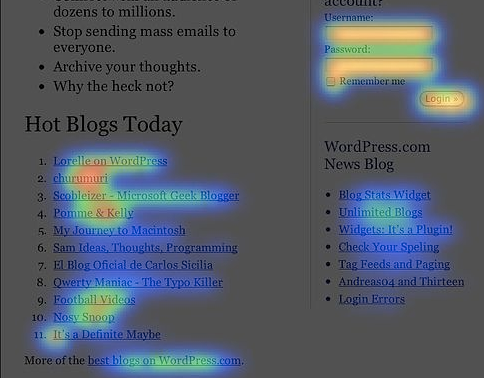
(Source)
The part that looks like someone developed a photograph using all the wrong methods is the section that had the most hovers and clicks.
So, if I wanted to place the key details of my landing page somewhere, the top right section of the page would be where I’d do it, in that case.
You can also use a scroll map
More or less the same thing, but looks like this:
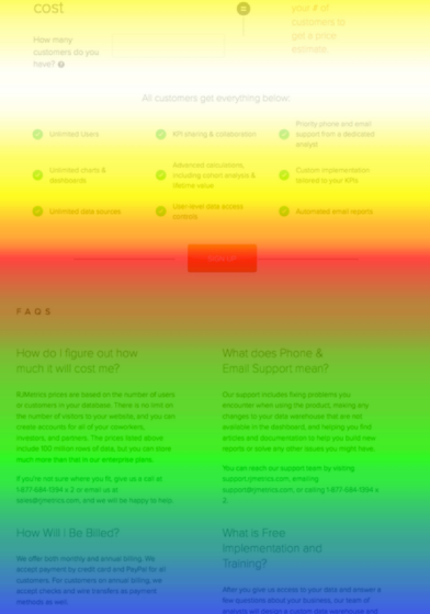
(Source)
Hot colors are used here to represent the more “popular” parts of a page, whereas the colder colors represent the parts of the page people scrolled past.
As you can see, the center of the page is where the action happens, in this experiment.
These two methods will help you realize what part of your landing page will entice users.
This way, you’ll know exactly what needs to go where, a fact that will help you get one step further and complete a major piece of the puzzle.
Imagine combining landing page optimization and heat maps with buyer personas and user surveys…
No goals, no reason to have a landing page
Before I get on with the actual optimization, I’ll need to make something super clear:
You need actual, actionable goals for your landing page to work!
And now, you’ll ask: “But Téa, isn’t lead generation my goal?”
This, my friends, is your end goal. What is this landing page supposed to guide users to do? What kind of action does it tell the prospects to take?
If it’s signing up for a demo, then this is the only thing it should be prompting the users to do.
The same goes for downloading free goodies, subscribing to your email list and so on and so forth.
This is important, not only because it will shape your CTA to the fabulous little button it’s supposed to be more on that, but also because your prospect will have one job and one alone.
And now, moving on to…
Actual Landing Page Optimization 101
And here we are, all ready to talk about the optimization part of the lead-gen landing page itself.
The first thing to do would be to use a landing page builder!
So, sit back and relax, we’ve got this!
Pro Tip: Here’s the ultimate guide on how to create a landing page, in case you were wondering!
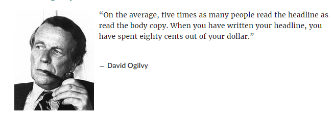
1. Starting with the headline
What would that post be without that fantastic title? Well, nothing. And if you don’t believe me, see what the father of modern advertising had to say about this:
(Source)
Your headline needs to be clear and compelling, with the benefit showing as clear as day.
Why would any prospect waste precious time on reading your body copy just to realize they’re not interested in whatever it is that your landing page is about?
Capture their attention-and by extension, the lead-with some first-class headline that will either push the prospect to take a specific action or will play the numbers game.
Meaning that you’ll actually use a number to showcase the value of what you’re saying.
Of course, the wording of your headline cannot differ in any way, shape or form from the body copy of the landing page. Otherwise, you’ll create an inconsistent tone of voice.
And you’ll suffer the consequences:
(Source)
Another thing to keep in mind:
A headline can do a whole lot of things, but being confusing and complicated is not something that will do you any favors. Like, at all.
Now imagine a headline being confusing and boring. Well, did this ship sink? I think so.
Try and invest in your copy as much as you can
You need your prospects to have two basics in mind, after reading just the headline:
- That you can make them into the best version they can be
- That they need to take up on what you’re offering because they’re smart
The first one is true because people nowadays don’t buy products, they buy solutions to their problems.
And the second one is true because an enticing lead magnet always looks simple, straightforward and seems like the smartest choice.
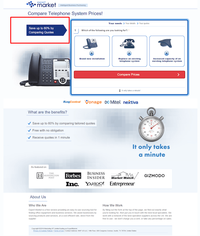
(Source)
This landing page example is one of the best ones. You can see that we’ve got the numbers upfront at the headline itself.
It seems like “saving up to 60%” is a pretty good deal, if I say so myself.
Moving on to the elements
Lose navigation. Honestly, it’ll be the best decision you made for your lead-gen landing page optimization.
Unlike a homepage or a website, lead-gen landing pages, or any landing page in general, don’t need any extra options other than the CTA button that tells them what to do.
The only thing you need the visitor to do is to convert.
If you don’t believe me, you can read about this amazing case and keep in mind that a landing page’s job is to convert and not distract.
You’ve got as little as 8 seconds to make an impression, and by including links on your landing page, you’re pretty much asking for your users to get distracted.
How is this going to do you any good?
Moreover, a proper landing page supports all of the key elements I’m going to refer to in a minute, without distracting the user.
Rather, it makes things fall into place in a way that seems effortless, which leads the user to conversion.
Just forget the links to things that won’t convert. But always, always give your users a way out, you don’t want them to feel like a bull in a china shop-ie trapped.
In other words, you should do it like these guys:
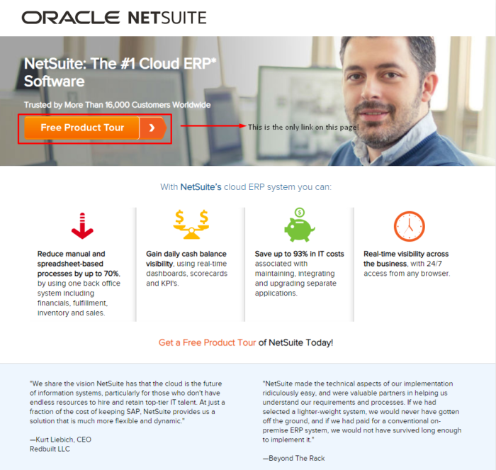
(Source)
The CTA button is the only thing that’s linked
And if you click on it, you get redirected here:
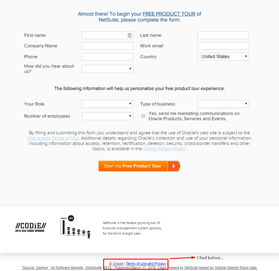
So, you get to the bottom of the page, where you can see all you need to fill out in order to begin your free product tour.
But I lied before. There is another link, one that is not visible but is pretty important.
The way out I told you about earlier. You should be smart enough to provide one, but without being obvious about it and without making your prospects feel distracted with heavy linking.
The last thing to remember when going forth with landing page optimization for lead generation would be that the landing page doesn’t need to be something totally different.
This could end up hurting your conversion, as your prospects are more likely to think that your page is a scammy one.
It should still look and feel like your actual website, as your brand is what the prospects are interested in-it’s what led them to the landing page in the first place.
The “Face” Of Your Lead-Gen
And by “face”, I mean the holy trifecta:
- Images
- copy
- form/s
1. Your landing page images
need to be paired with your information and your idea, first of all. Here’s why:
(Source)
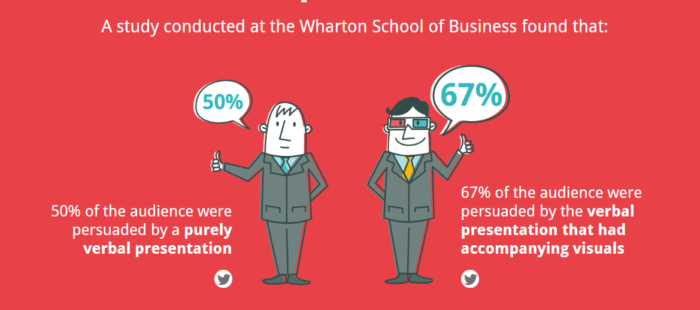
Imagine how many conversions you are going to lose if you don’t pay extra attention to pairing your images with your copy and the form itself.
If your landing page aims to motivate people, pair it with motivational videos or testimonial videos.
If your landing page aims to show discounts and savings, don’t hesitate to showcase value right from the start, in the form of product photos.
2. Paired with the landing page copy you need…
But why is this so important? Let me give you an example:
You’ve had a busy day, you can’t wait to go home and as you’re waiting for your bus to come, you scroll through social media.
And you bump into an ad.
And you click on it and get redirected to their (optimized!) lead-gen landing page.
With one eye on the road and one eye on the phone screen, are you likely to actually read the copy in full or just scan through the text and look for important words that make sense to you?
This is why landing page optimization requires copy that will be getting straight to the point-otherwise there is a turning back, and it will be your customer pressing the back button.
Since the goal of a landing page is to convert-generate leads, in our case-you need copy that does exactly that. So, don’t get too creative with it, not this time.
Time is money for you and your prospects, and this means that they can’t really afford to look for the hidden meaning behind what you’ve written.
And you can unfold all of your creativity on other pages that need you to be creative. Like the homepage of the website itself.
A landing page is there to make your users convert. And this means that everything, all of its elements, should lead to this goal
Oh and another thing that will make your users go…
Grammar.
If we’re talking about lading page optimization-or any kind of optimization really-, it’s a crucial thing.
I bet you don’t want to look like a spammer or, in the case that you need someone to give you their details, like a total scam.
3. The truth about your landing page forms
The less information a prospect needs to give you, the better.
This is true for many reasons, the main of which would be saving time, but it’s not limited to that.
The more information you need, the more likely it is for the prospect to wonder why they’d need to tell you a whole lot of things about them.
You’ll need to know only what your business needs, in order for your lead-gen to produce actual results, with actual qualified leads.
Of course, you’ll need the shipping info, if you’re going to ship them a freebie you’ve used as a lead magnet.
Of course, you’re going to ask for the size of their business, if it makes sense when it comes to their qualifications, but how useful is the name of their company, let’s say?
“But Téa, what does that have to do with landing page optimization?”
Lemme clear it up: Privacy, especially in the post-GDPR era, is something that can make or break pretty much any and all marketing efforts.
More Specific Tips
Like a true 101, the section above needed to cover the basics. But, those tips won’t get you too far, if you don’t use everything you can. And this means that we’ll need some more, in-depth action.
There are more things you’ll need to optimize if you want your lead-gen landing page to work. So, stick with me, please!
1. Some CTA action
Bet ya anything that you read the landing page copy section and you thought I forgot about the CTA and you were all ready to chuckle, right? Well, think again!
The CTA is the most important part in every single case. How could I ever forget?
The best CTA’s invoke many quick reactions. How do you do this? Use short, commonly understood, action-oriented words.
Like it or not, the vast majority of your online viewers are skimmers and scanners. The simpler the words you use to you present your ask, the more it’s going to resonate with your audience.
The more action-oriented your CTA verbs are, the more immediate reactions you’ll provoke.
Here are a few examples of conversion stimulating CTA’s, based on your landing page objectives:
First of all, your CTA needs to be quick-witted, sharp yet easy to understand. After all, we’re talking about the one button that you need them to notice and click on.
I’d also recommend that you use your CTA verb in the headline. You reinforce the action you’re asking your visitor to take, by making your landing page purpose very clear.
Just use words that capture attention and prompt prospects to take the desired action
Like this:
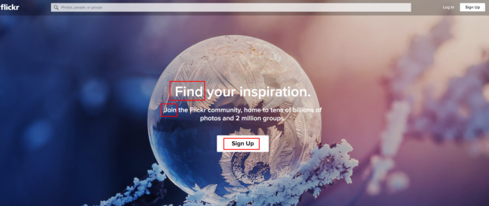
(Source)
The “Sign Up” was enough. As it should be.
What is more, this landing page showcases the clear-as-day value of signing up, using verbs that prompt action and being clear on the benefit of signing up: Tens of billions of photos and 2 million groups.
So, let’s suppose you want to use this photo hosting service. You’ve got a clear benefit and social proof right there: tens of billions of photos are hosted there, so all these users can’t be wrong.
But how would you feel if this CTA was the only thing on the page? Why would it kill landing page optimization in that case? Wouldn’t this look weird and ill-timed? Spammy, even?
This is why you need to ease people into your CTA action. You can’t just have them convert without having explained things first.
So, use what I mentioned before-remember, a heat map, the clever copy, how pretty y’ all are-and make your users actually need to see the CTA, want it even.
But for God’s sake, don’t make them look for it! Cause if you do, they’ll just walk away.
Use colors that contrast, for your buttons
A little white-on-red action never harmed anyone:

(Source)
Does it pop? Yes. Do you want to click on it? Yes. Does it look fancy?
Definitely!
This coming to you from Netflix, one of the masters of engagement.
Now, moving on to….
2. Use lead magnets, magnets, magnets
You already know what a lead magnet is. But do you know how to use it to nail landing page optimization and grab the leads you want?
A valuable lead magnet can increase your lead generation quickly, so long as it’s something that adds value to what you’re saying and can actually make the users into a better version of themselves.
The freebie doesn’t need to be costly. In fact, it doesn’t need to be something you have to pay for at all. It just needs to be a free, valuable gift, like an ebook or a list of ideas.
Just keep in mind that the freebie needs to be on a par with what kind of data your prospects need to give you. Don’t make them work too hard.
Conduct your research, always always check what the competition can offer them and combine that information with the data you’ve already got.
This will help you grow a list with referrals as well, seeing as, if your prospects enjoy what you’re giving them for free, they’ll definitely suggest your content to their peers, for a number of reasons.
And looking smart for finding that kind of bargain is definitely the first one.
3. That sweet secure feeling
Even if you’re the best person on the planet and you’ve built a brand around the notion that you wouldn’t even touch a fly off the wall, you are still a stranger on the internet, asking for user data.
Your landing page should convey that people and brands trust you and that the leads should trust you as well.
So, let’s see what you can include, in order to show your prospects that you’re the real deal:
Trust Badges
Ever seen a landing page with a trust badge like Norton Security’s logo? There’s a reason this thing exists, and it’s to show that you are, indeed, a legitimate company and not a scammer who just asks for data to sell around.
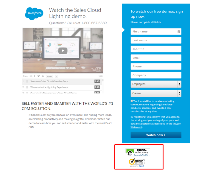
(Source)
So go ahead and do it as Salesforce did it in the example above!
Social Proof
Testimonials. Reviews. Anything that can show that your company is trustworthy and that people actually enjoy your product, to the point that not giving their email address to you, to get that freebie, will look like the stupid choice.

Imagine seeing that kind of review but not taking any action. It would be a huge shame, am I right?
The point here is to convince the prospects through social proof, that they needn’t be too protective of their data and that not revealing their email address would be the immature choice in that case.
GDPR Compliance and T&C’s
GDPR compliance is no joke and it shows right here:
(Source)
If you’re GDPR-compliant and completely clear and transparent with your Terms and Conditions and prospects can access that straight on, then you’re in for a real treat.
Prospects will surely become leads, seeing as you’re giving them all of the reasons to trust you and give you their data, Privacy Policy and all!
4. Be nice
What do you do when someone gives you something? Do you take whatever it is that you asked for and just get up and leave? Or do you thank them?
I consider a Thank You Page to be essential when it comes to everything, especially with landing page optimization for lead-gen.
Your prospects should and need to know that you’re not there for a quick win. Rather, you’re there for the long game, and that’s what will nurture them down the line.
And since you needed to go easy on the links before, you can just show more things now, such as additional resources.
5. Above or below the fold?
Yes, yes, you need to keep things above the fold. You need your CTA to be there for your prospects when nobody else is.
However, there has been all this talk about above and below-the-fold content that it seems silly in 2020 (almost), seeing as there’s a much simpler solution.
You see, the above-the-fold mania began in the 90s, when everything was a landing page, seeing as nobody ever scrolled down, for fear of the page freezing and/or totally dying on them.
No, we don’t do that anymore
With today’s internet connection options though, there is no such fear. The only fear is the prospect’s impatience, which can vary. This is why you need that scroll map I mentioned before.
That way, you’ll have all the data you need, straight up and ready for you to use.
I mean, who wants to risk losing conversions because they created something with above-the-fold info only and came to the realization that their prospects dropped out because of crummy design?
Final Tips Y’ All!
If you stuck with me…
GET READY FOR SOME LANDING PAGE OPTIMIZATION LAST TIPS!
- Be clever with the colors you use: Green for wealth, blue for extra knowledge, red for urgency, yellow for fun.
- Keep CAPTCHA out of the picture, or if you must use it, make it stupid simple
- In fact, make everything stupid simple
- Use a timer to utilize the Fear Of Missing Out
- Test. All. The. Time
- Change key elements from time to time and use long-tail keywords to make sure you’ll target the correct people
- Make ads shareable so more people will see them, share them, click on them and, eventually, land on your page and become leads
- Make sure to provide A’s to these Q’s: Why did I get here? How do I get stuff? Why do you want my info?
- Awareness, Interest, Desire, Action (AIDA) is not just a sales technique, it’s a tactic to get you everywhere. Use this principle when setting up your landing page.
- Create a different page for each lead type. You’ll need one for the 20-year-olds, another one for 30-year-olds and a different one for the stay-at-home parents.
The End… For Now
After all these tips and all this exhausting analysis, I think that you’re more than ready to optimize your landing page for lead generation and turn it into a lead-gen machine!
In other words, just use what I told you and leave me a comment with techniques of your own, and you’ll up your lead-gen game in no time, for sure.
And now this is buh-bye!
Until next time….
Similar Posts


Create, send and optimize your email marketing campaigns!